
SUPERCHEF NEPAL
Food products that look as good as they taste.
Setting the scene.
SUPERCHEF operates across everyday food categories where product communication needs to be immediate and relatable. I focused on creating advertising that made the products visually appealing while keeping the message clear, accessible, and commercially relevant.
The problem to solve.
Food advertising has to communicate product value quickly while creating appetite and attention. The challenge was balancing strong visual appeal with clear product communication without overwhelming the audience with unnecessary messaging.
The creative bet.
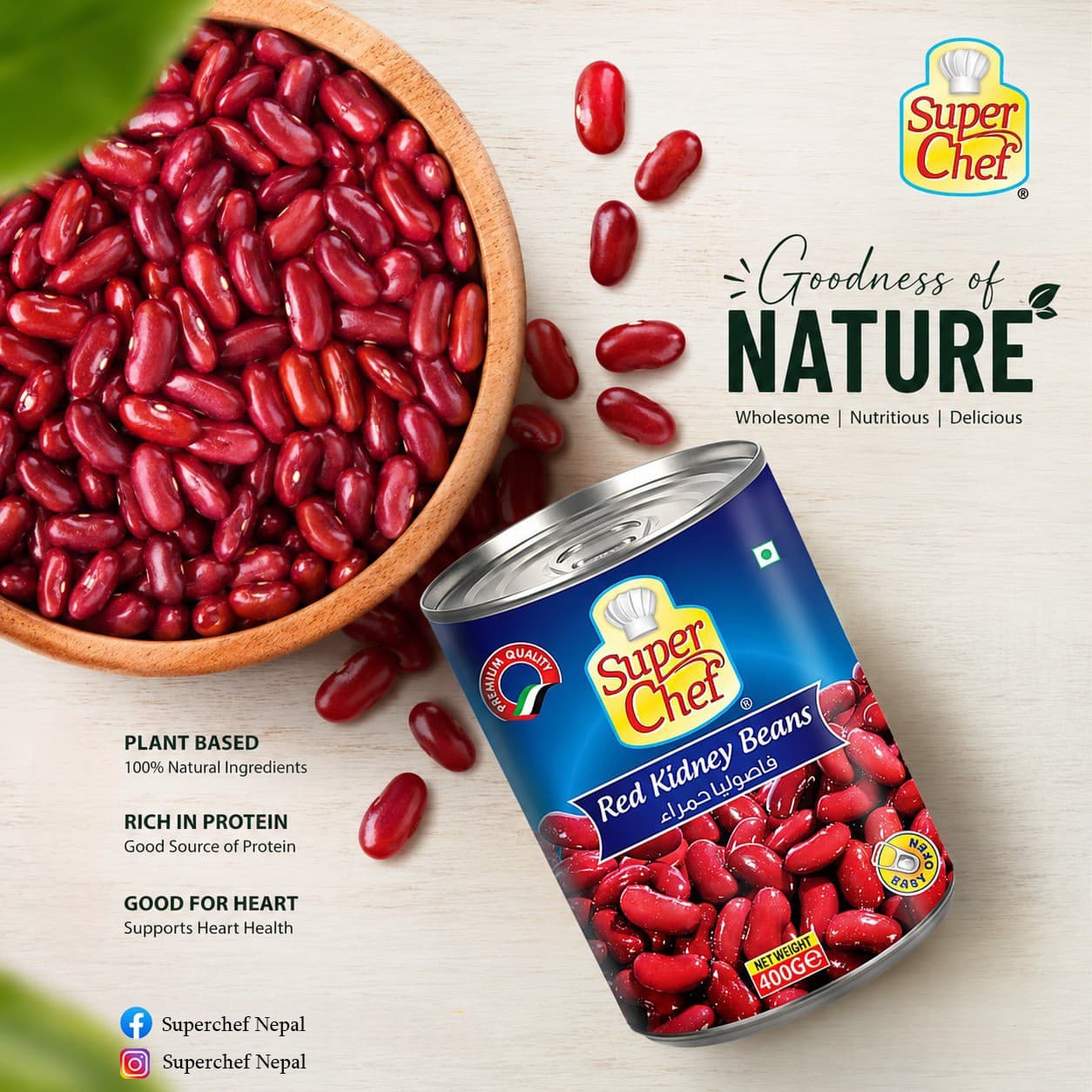
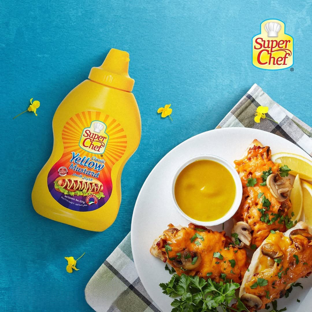
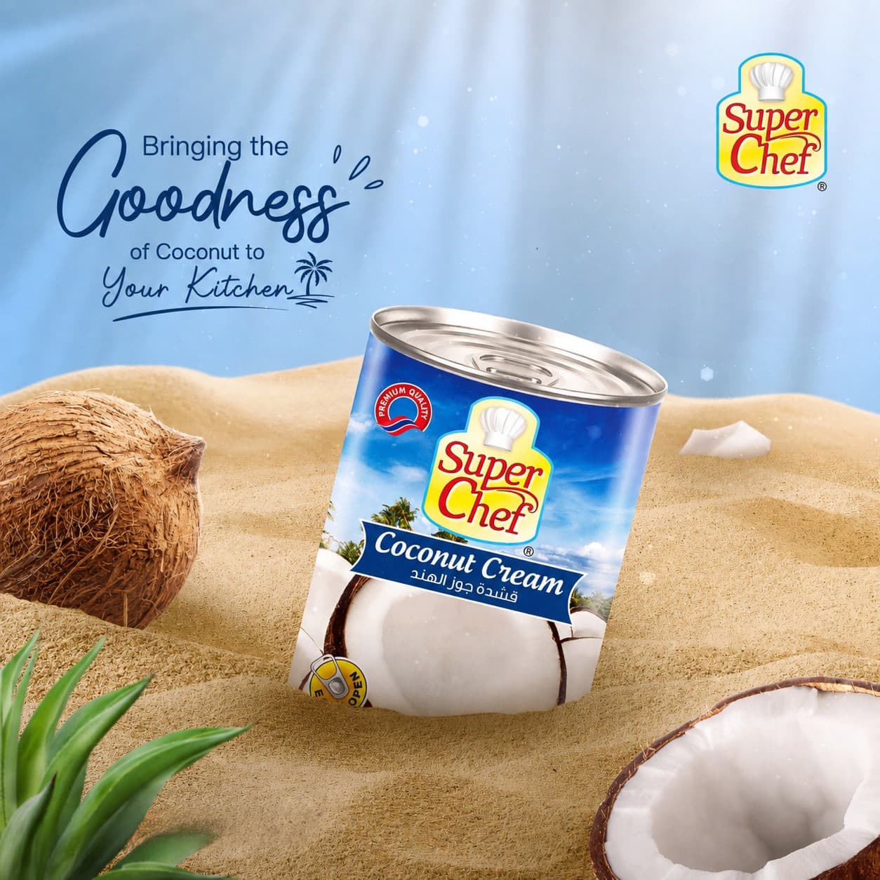
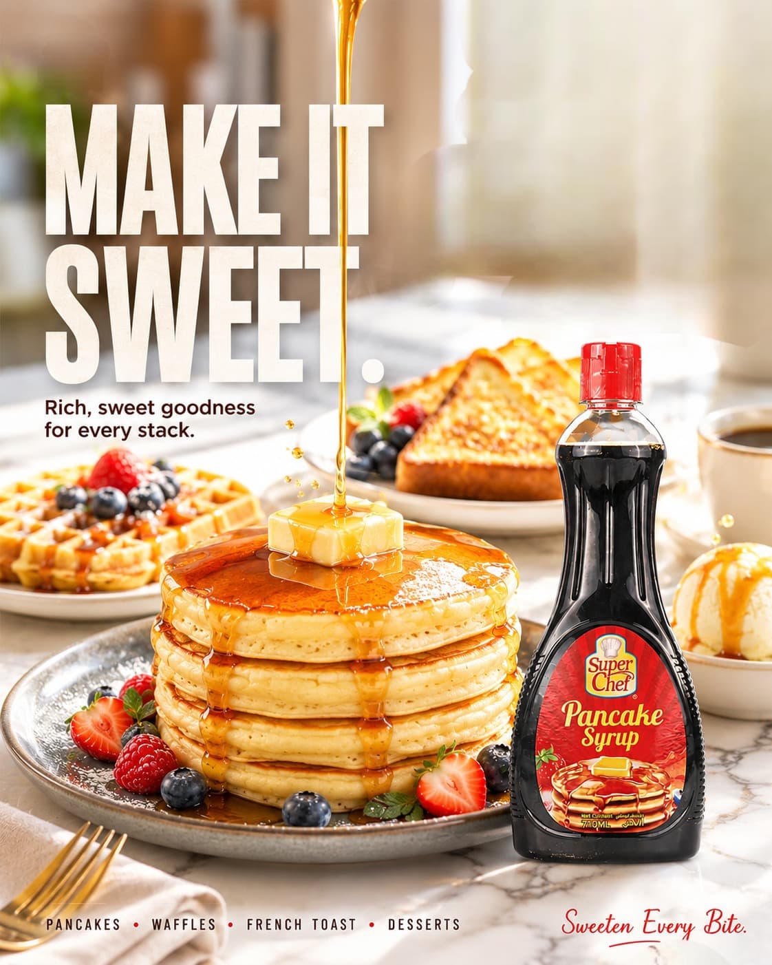
The creative direction was product-first, using appetising food styling, strong product hierarchy, clean compositions, and direct messaging. Visuals were designed to make the product instantly recognisable while creating a stronger emotional connection with everyday food occasions.
Bringing it to life.
Created product advertising, promotional creatives, social media designs, and campaign visuals across the SUPERCHEF range. I combined product photography, graphic design, composition, typography, and brand consistency to develop content suitable for both social and promotional communication.
What the work delivered.
Created clearer and more appetising communication for everyday food products.
Consistent promotional system across the range
Assets that work in retail and social contexts
Clarity
Product-first
Every frame communicates exactly what is inside the tin.
Appeal
Appetite-led
Warm, cooked-in, ready-to-serve visual language.
System
Consistent
One design language across the whole range.
Next Project